



Esto bien merece un hueco aquí. Después de cinco meses de trabajo con mi nuevo grupo, The Dry Aubergines, es gratificante presentar nuestra primera demo.


26.2.14
R.I.P. Paco de Lucía
Hoy hemos perdido al mejor guitarrista de la historia de España. Descansa en paz, Paco de Lucía.
9.2.14
Amazon.co.uk vs. Amazon.es
Si, viviendo en España, un CD de música me cuesta 23€ en Amazon.es y sólo 14€ si lo compro por Amazon.co.uk, CON GASTOS DE ENVÍO INCLUÍDOS, es que algo falla en el sistema.

19.12.13
Ingeniero en Informática: 100% completado
Finalmente, hoy me he convertido en Ingeniero en Informática por la Universidad de Zaragoza.
27.10.13
Omar Khayyám y ecuaciones cúbicas
Omar Khayyám es mi héroe del día por esto:
[...]
Omar Khayyám's solution
As shown in this graph, to solve the third-degree equation $x^3 + a^2x = b$ where $b>0$, Omar Khayyám constructed the parabola $y=x^2/a$, the circle with diameter $b/a^2$ having its center on the positive x-axis and intersecting the origin, and a vertical line through the point above the x-axis where the circle and parabola intersect. The solution is given by the length of the horizontal line segment from the origin to the intersection of the vertical line and the x-axis.[...]
[Cubic function @ Wikipedia]
30.7.13
Sharknado

Una marea de miles de tiburones arrastrados por un temporal de proporciones épicas amenaza las calles Los Ángeles. Y creo que no hay mucho más que decir.
Divertida. Impactante. Sorprendente hasta el final.
Ya estoy esperando la segunda parte.
Divertida. Impactante. Sorprendente hasta el final.
Ya estoy esperando la segunda parte.
26.7.13
Infortunios
«Porque en todas las malas pasadas que juega el destino el más triste de los hombres desgraciados es aquel que ha sido feliz.»
15.7.13
The Cuckoo's Calling

Nada como convertirse en un completo desconocido para que el público valore tu trabajo sin prejuicios. Para eso, y para no sufrir la presión de altas expectativas. Al menos esto es lo que ha debido de pensar J. K. Rowling, que lanzó el pasado 30 de abril The Cuckoo's Calling bajo el pseudónimo de Robert Galbraith. Con total discreción, sin bombos publicitarios ni impacto mediático. Rowling declara que «ser Robert Galbraith es una experiencia liberadora». Y es que es de suponer que la corona pesa. Aunque le hubiera gustado mantener el secreto durante más tiempo, detalles como el estilo de la narrativa y utilizar la misma editorial han terminado desvelando su verdadera identidad.
Con The Cuckoo's Calling, Rowling cambia de género. Del humor negro a la novela policíaca. Una apuesta arriesgada en un género bastante superpoblado. La investigación de un incierto suicidio por parte de un ex-combatiente de Afghanistán retirado como detective privado nos describirá un mundo de supermodelos, estrellas del rock y dinero en exceso. Nuevos ingredientes como la provocación, el placer y la seducción dan a entender que la autora no tiene intención de volver a la literatura juvenil.
Tan solo siete meses después de la publicación de The Casual Vacancy, Rowling vuelve a las andadas con una nueva novela que espero tenga mejor resultado. Pese a aprovechar el tirón de Harry Potter, el globo de The Casual Vacancy se fue desinflando poco a poco hasta pasar desapercibido. Por mi parte, tras retomarla un par de veces, reconozco que ha terminado cogiendo polvo en la estantería, aunque que el hecho de no ser muy aficionado a la lectura y tratar de leérmela directamente en inglés no ayudó precisamente. Probaré de nuevo con The Cuckoo's Calling, pero esta vez con bastantes menos expectativas.
Con The Cuckoo's Calling, Rowling cambia de género. Del humor negro a la novela policíaca. Una apuesta arriesgada en un género bastante superpoblado. La investigación de un incierto suicidio por parte de un ex-combatiente de Afghanistán retirado como detective privado nos describirá un mundo de supermodelos, estrellas del rock y dinero en exceso. Nuevos ingredientes como la provocación, el placer y la seducción dan a entender que la autora no tiene intención de volver a la literatura juvenil.
Tan solo siete meses después de la publicación de The Casual Vacancy, Rowling vuelve a las andadas con una nueva novela que espero tenga mejor resultado. Pese a aprovechar el tirón de Harry Potter, el globo de The Casual Vacancy se fue desinflando poco a poco hasta pasar desapercibido. Por mi parte, tras retomarla un par de veces, reconozco que ha terminado cogiendo polvo en la estantería, aunque que el hecho de no ser muy aficionado a la lectura y tratar de leérmela directamente en inglés no ayudó precisamente. Probaré de nuevo con The Cuckoo's Calling, pero esta vez con bastantes menos expectativas.

15.5.13
MacBook parpadeante
Tengo un MacBook Pro 13'', con procesador Intel Core i5 y con 4GB de RAM, comprado en Mayo de 2011. El tipo de pantalla es normal, nada de Retina Display. La GPU: Intel HD Graphics 3000. A día de hoy sin extras añadidos.
Sin embargo, abro esta imagen que representa un gradiente a priori corriente y moliente, y me encuentro con que la zona de la pantalla donde está la imagen en cuestión parpadea como si fuera un viejo monitor CRT.

Eso sí, para que esto suceda es requisito indispensable abrir la imagen al 100% de su tamaño. O lo que es lo mismo, la frecuencia del gradiente debe ser la de la imagen original.
Pensaba que sería algo del deterioro de la pantalla, pero al parecer es algo habitual de las pantallas de algunos MacBook, se puede comprobar leyendo algunos foros como éste, éste y este otro. Lo más flipante son las respuestas de algunos usuarios quitándole importancia al asunto con un "Es algo normal". Sucede con gradientes de frecuencias particulares, pero el que pongo yo no es el único. El mismo efecto ocurre si cambias la orientación del gradiente de horizontal a vertical, aunque se anula si la orientación es cualquier otra. El efecto también disminuye si no miras la pantalla totalmente de frente. Y no parece ser problema de la tarjeta gráfica, porque en el monitor externo que tengo conectado al MacBook no pasa.
Si tienes un MacBook quizá lo hayas visto antes, quizá no, o quizá prefieras no haberlo visto justo ahora. No tengo claro si sucede en todos los modelos, así que si tienes uno ya comentarás por aquí abajo si te pasa lo mismo :) A mi me ha costado dos años toparme con un gradiente que lo produjera. Sólo espero que, por su bien, los de Apple lo hayan arreglado en los nuevos modelos.
Sin embargo, abro esta imagen que representa un gradiente a priori corriente y moliente, y me encuentro con que la zona de la pantalla donde está la imagen en cuestión parpadea como si fuera un viejo monitor CRT.
Eso sí, para que esto suceda es requisito indispensable abrir la imagen al 100% de su tamaño. O lo que es lo mismo, la frecuencia del gradiente debe ser la de la imagen original.
Pensaba que sería algo del deterioro de la pantalla, pero al parecer es algo habitual de las pantallas de algunos MacBook, se puede comprobar leyendo algunos foros como éste, éste y este otro. Lo más flipante son las respuestas de algunos usuarios quitándole importancia al asunto con un "Es algo normal". Sucede con gradientes de frecuencias particulares, pero el que pongo yo no es el único. El mismo efecto ocurre si cambias la orientación del gradiente de horizontal a vertical, aunque se anula si la orientación es cualquier otra. El efecto también disminuye si no miras la pantalla totalmente de frente. Y no parece ser problema de la tarjeta gráfica, porque en el monitor externo que tengo conectado al MacBook no pasa.
Si tienes un MacBook quizá lo hayas visto antes, quizá no, o quizá prefieras no haberlo visto justo ahora. No tengo claro si sucede en todos los modelos, así que si tienes uno ya comentarás por aquí abajo si te pasa lo mismo :) A mi me ha costado dos años toparme con un gradiente que lo produjera. Sólo espero que, por su bien, los de Apple lo hayan arreglado en los nuevos modelos.
9.5.13
Botanical Garden @ University of Copenhagen
En mi regreso a Dinamarca la semana pasada para visitar a unos cuantos amigos, aproveché para hacer algo que me quedó pendiente el año pasado: visitar por completo el Jardín Botánico de la Universidad de Copenhague. No hay duda de que la vegetación más vistosa se encuentra en los invernaderos, concretamente en la Palm House. Cinco zonas con pequeños microclimas de todo el mundo que demuestran que en Copenhague sí se puede llegar a los 40 grados. El sitio es de visita obligada, está en pleno centro de la ciudad y por increíble que parezca es gratis. Así que si viajas a la ciudad en la que Christian Andersen paso la mayor parte de su vida, no hay excusa que valga.
Pese a que no soy aficionado a la botánica, sí lo soy a la fotografía, así que ahí van unas cuantas instantáneas que cogí, mucho mejor en pantalla completa :)
Pese a que no soy aficionado a la botánica, sí lo soy a la fotografía, así que ahí van unas cuantas instantáneas que cogí, mucho mejor en pantalla completa :)
28.4.13
Inoxidabilizando
¿Son todos los aceros inoxidables? Evidentemente no, si no no se denominarían a algunos aceros específicamente inoxidables. El acero es una combinación de hierro y carbono. El primero es extremadamente sensible al oxígeno, y combinarlo con el segundo no hace nada por evitarlo. Así que para reducir los efectos de oxidación, el acero se mezcla (o más propiamente dicho se alea) con un porcentaje de cromo de, como mínimo, un 11%.
El cromo está distribuído uniformemente en todo el volumen del material (no es un recubrimiento) y reacciona con el oxígeno formando una capa inerte de unos pocos átomos de espesor en la superficie del acero que previene que el oxígeno reaccione con él. Es similar a una capa de óxido invisible, pero al contrario que el óxido, evita que el oxígeno se vaya comiendo el acero.
El cromo está distribuído uniformemente en todo el volumen del material (no es un recubrimiento) y reacciona con el oxígeno formando una capa inerte de unos pocos átomos de espesor en la superficie del acero que previene que el oxígeno reaccione con él. Es similar a una capa de óxido invisible, pero al contrario que el óxido, evita que el oxígeno se vaya comiendo el acero.
Con un poco de cachondeo: Como reza el comentario de Miguel aquí abajo, Viento negro, fuego y acero, una versión españolizada de Black, wind fire and steel de los Manowar.
21.4.13
Integrando
Se me ocurre pasar por xkcd.com después de una larga temporada sin echarle ojo y me encuentro con esto:

La verdadera naturaleza de la integración por partes, un (más que habitual) espejismo matemático obra de algún dios cruel y despiadado. Una viñeta altamente hilarante no apta para gente de letras ;-)
La verdadera naturaleza de la integración por partes, un (más que habitual) espejismo matemático obra de algún dios cruel y despiadado. Una viñeta altamente hilarante no apta para gente de letras ;-)
19.4.13
Dallas - Memphis
Es de esas canciones con una de esas letras que me gustan. Personales, un tanto esotéricas y con pizcas de significado en frases cortas. Versos difíciles de encajar, de los que no desvisten la emoción de todo el mundo.
La versión original de estudio merece mucho la pena también por la música. Dejo esta grabación en la radio, más sincera. Un tema del último disco de Quique González.
La versión original de estudio merece mucho la pena también por la música. Dejo esta grabación en la radio, más sincera. Un tema del último disco de Quique González.
El sombrero pesa más que la cabeza,
las ideas se pelean con las balas.
Le rezan a la virgen del rencor
las chicas malas.
Mis amigos no querían darse cuenta
se creían que era alguno de mis dramas.
Tocaba en Autopista y la quería,
no podía quejarme de nada.
Bajos fondos, carne débil,
quizá soy lo que menos necesita.
Se fue dejando un rastro de confeti,
la luz del garaje encendida.
El misterio dura más que la certeza,
y esos días yo bebía demasiado.
Si ha sido sólo pura coincidencia,
te invito a un trago.
Bajos fondos, carne débil.
Ejércitos de rock rompiendo filas.
Se fue dejando un rastro de confeti...
Doble rombo, ponte sexy,
supongo que ahora duermes calentita.
Las tres de la mañana Dallas-Memphis
la luz del garaje encendida,
la luz del garaje encendida.
las ideas se pelean con las balas.
Le rezan a la virgen del rencor
las chicas malas.
Mis amigos no querían darse cuenta
se creían que era alguno de mis dramas.
Tocaba en Autopista y la quería,
no podía quejarme de nada.
Bajos fondos, carne débil,
quizá soy lo que menos necesita.
Se fue dejando un rastro de confeti,
la luz del garaje encendida.
El misterio dura más que la certeza,
y esos días yo bebía demasiado.
Si ha sido sólo pura coincidencia,
te invito a un trago.
Bajos fondos, carne débil.
Ejércitos de rock rompiendo filas.
Se fue dejando un rastro de confeti...
Doble rombo, ponte sexy,
supongo que ahora duermes calentita.
Las tres de la mañana Dallas-Memphis
la luz del garaje encendida,
la luz del garaje encendida.
17.4.13
PP~ifias mentales
Con esto de la CosPEDAL y las indemnizaciones en diferido, los del PP van subiendo el nivel de las pifias mentales. La de Cospe me recordó mucho a la no tan vieja fumada de José Ramón Bauzá allá por noviembre de 2011. Y por supuesto no puede faltar Límite 48 horas de José María Aznar, una intervención digna de premio Nobel, popularizada por El Informal en aquellos tiempos en los que Telecinco era una televisión de calidad.
Ahora mismo no se me ocurre ninguna más, pero si alguien me comenta alguna actualizaré el post :)
Ahora mismo no se me ocurre ninguna más, pero si alguien me comenta alguna actualizaré el post :)
Bonus: Atentos a la última frase en la biografía de Bauzá que he enlazado a la wikipedia. Troleo máximo. Gracias a @mldelpueyo que se ha percatado!
14.4.13
Animated Erasmus
Del departamento de Refritos de GIFs animados con temáticas variadas llega My Erasmus. Otra reformulación de GIFs animados con títulos acordes a la temática erasmus. Igual de hilarante que muchas otras que hay por la web. Mis preferidos:

When I finally found an apartment in my erasmus city.

When I get home after erasmus party.
Google Fonts
Uno de los problemas del diseño web es que el conjunto de tipografías soportadas por los navegadores (las denominadas web safe fonts) es muy reducido, así que si quieres usar una tipografía más original o diferente en tu web es necesario que la alojes en alguna parte e insertes el código en la plantilla para que se cargue con la página. Y aquí entra un servicio de Google que he descubierto hace poco: Google Fonts. Google Fonts ofrece un montón de tipos de letra gratuitos clasificados en 4 categorías, y que permite filtrar para encontrar lo que buscas. Además te da el código fuente que has de insertar en tu plantilla y una estimación de la sobrecarga que va a suponer a la hora de cargar la página.
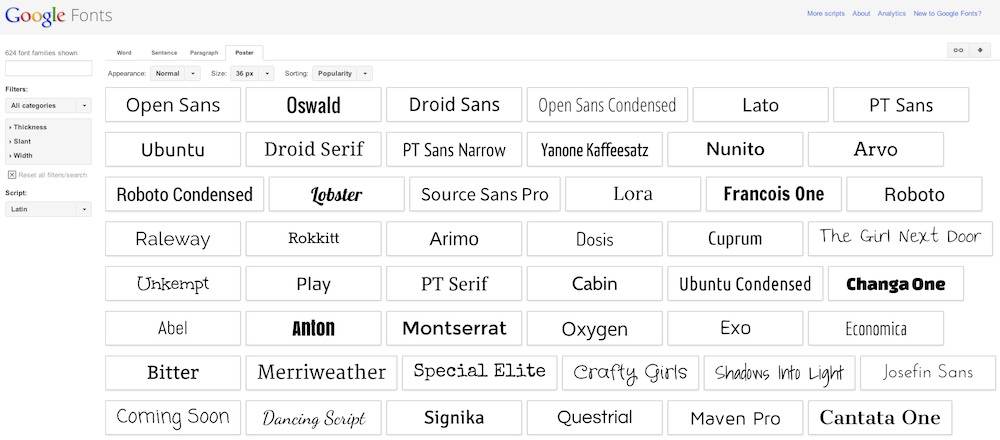
Hay otras maneras de utilizar tipografías no estandar en tu web, como por ejemplo alojar el archivo de la tipografía en tu servidor y cargarla insertando este trozo de código en la plantilla:
Con esto ya podrás usar esta tipografía para cualquier trozo de texto simplemente utilizando style="font-family: 'Name of your font'" en el estilo de ese trozo. La desventaja que tiene este método es que me da la impresión de que es más lento que cargar las tipografías a través de Google Fonts. La ventaja es que no dependes de Google Fonts, que como ha pasado con el servicio Google Reader, en cualquier momento Google puede anunciar que lo jubila.
Hay otras maneras de utilizar tipografías no estandar en tu web, como por ejemplo alojar el archivo de la tipografía en tu servidor y cargarla insertando este trozo de código en la plantilla:
<style type="text/css">
@font-face {
font-family: "Name of your font";
src: url(http://www.nameofyourserver.org/yourfont.ttf) format("truetype");
}
</style>
@font-face {
font-family: "Name of your font";
src: url(http://www.nameofyourserver.org/yourfont.ttf) format("truetype");
}
</style>
Con esto ya podrás usar esta tipografía para cualquier trozo de texto simplemente utilizando style="font-family: 'Name of your font'" en el estilo de ese trozo. La desventaja que tiene este método es que me da la impresión de que es más lento que cargar las tipografías a través de Google Fonts. La ventaja es que no dependes de Google Fonts, que como ha pasado con el servicio Google Reader, en cualquier momento Google puede anunciar que lo jubila.

24.3.13
Probando LaTeX en Blogger
Integrando $\mathrm{\LaTeX}$ en Blogger se puede escribir de manera molona y en cualquier parte formulación matemática como por ejemplo la ecuación de render:
\[
L(x\to\Theta) = L_e(x\to\Theta)+\int_{\Omega_x}L(x\gets\Psi)f_r(x,\Psi \leftrightarrow \Theta)\cos{(n_x,\Psi)}\ \mathrm{d}\omega_{\Psi}
\]
Es tan fácil como insertar este trozo de código
después de la etiqueta <head> en la plantilla de tu blog y utilizar la sintaxis $formula$ y \[formula\] propia de $\mathrm{\LaTeX}$ en medio de cualquier post. Sospecho que funciona no solo para Blogger sino para casi cualquier página web $:)$
Y todo esto gracias a MathJax. Lo encontré googleando y llegando hasta este blog.
\[
L(x\to\Theta) = L_e(x\to\Theta)+\int_{\Omega_x}L(x\gets\Psi)f_r(x,\Psi \leftrightarrow \Theta)\cos{(n_x,\Psi)}\ \mathrm{d}\omega_{\Psi}
\]
Es tan fácil como insertar este trozo de código
<script type="text/javascript" src="http://cdn.mathjax.org/mathjax/latest/MathJax.js">
MathJax.Hub.Config({
extensions: ["tex2jax.js","TeX/AMSmath.js","TeX/AMSsymbols.js"],
jax: ["input/TeX", "output/HTML-CSS"],
tex2jax: {
inlineMath: [ ['$','$'], ["\\(","\\)"] ],
displayMath: [ ['$$','$$'], ["\\[","\\]"] ],
},
"HTML-CSS": { availableFonts: ["TeX"] }
});
</script>
MathJax.Hub.Config({
extensions: ["tex2jax.js","TeX/AMSmath.js","TeX/AMSsymbols.js"],
jax: ["input/TeX", "output/HTML-CSS"],
tex2jax: {
inlineMath: [ ['$','$'], ["\\(","\\)"] ],
displayMath: [ ['$$','$$'], ["\\[","\\]"] ],
},
"HTML-CSS": { availableFonts: ["TeX"] }
});
</script>
después de la etiqueta <head> en la plantilla de tu blog y utilizar la sintaxis $formula$ y \[formula\] propia de $\mathrm{\LaTeX}$ en medio de cualquier post. Sospecho que funciona no solo para Blogger sino para casi cualquier página web $:)$
Y todo esto gracias a MathJax. Lo encontré googleando y llegando hasta este blog.
Suscribirse a:
Entradas
(
Atom
)